
As an artist, I live life as a never-ending adventure.
Join me as I explore the world with pen and brush.
Chris Carter
Kaleidoscope Crone
"Chris has a wonderful teaching style and her years of experience show from the second she starts." Sarah
My continuing evolution as an artist ... watch the above video.
If you wish to replay certain sections or skip to a specific spot in the video, click this link to view it on Vimeo.


Take a class
These popular individual classes are a great place to start.

Drawing Alternatives
When you draw a wiggly line, when you draw a shape with that line, when you decide how light or dark you want that shape to be, you are learning to draw. With practice and observation, you become a master.
The updated, enhanced version of Drawing Alternatives is offered twice a year with limited enrollment for a more comprehensive, interactive learning experience. In addition to recorded videos the 2022 update includes live Zoom demos and live Q & A sessions.
Learn More
Color Scheme Game
Color is wonderfully complex and can be mercifully simple. Learn how to use a color wheel as a guide to understanding characteristics of pigments as you play with twelve different color schemes.
The updated, enhanced version of Color Scheme Game will be offered twice a year with limited enrollment for a more comprehensive, interactive learning experience. In addition to recorded videos the 2022 update includes live Zoom demos and live Q & A sessions.
Learn More
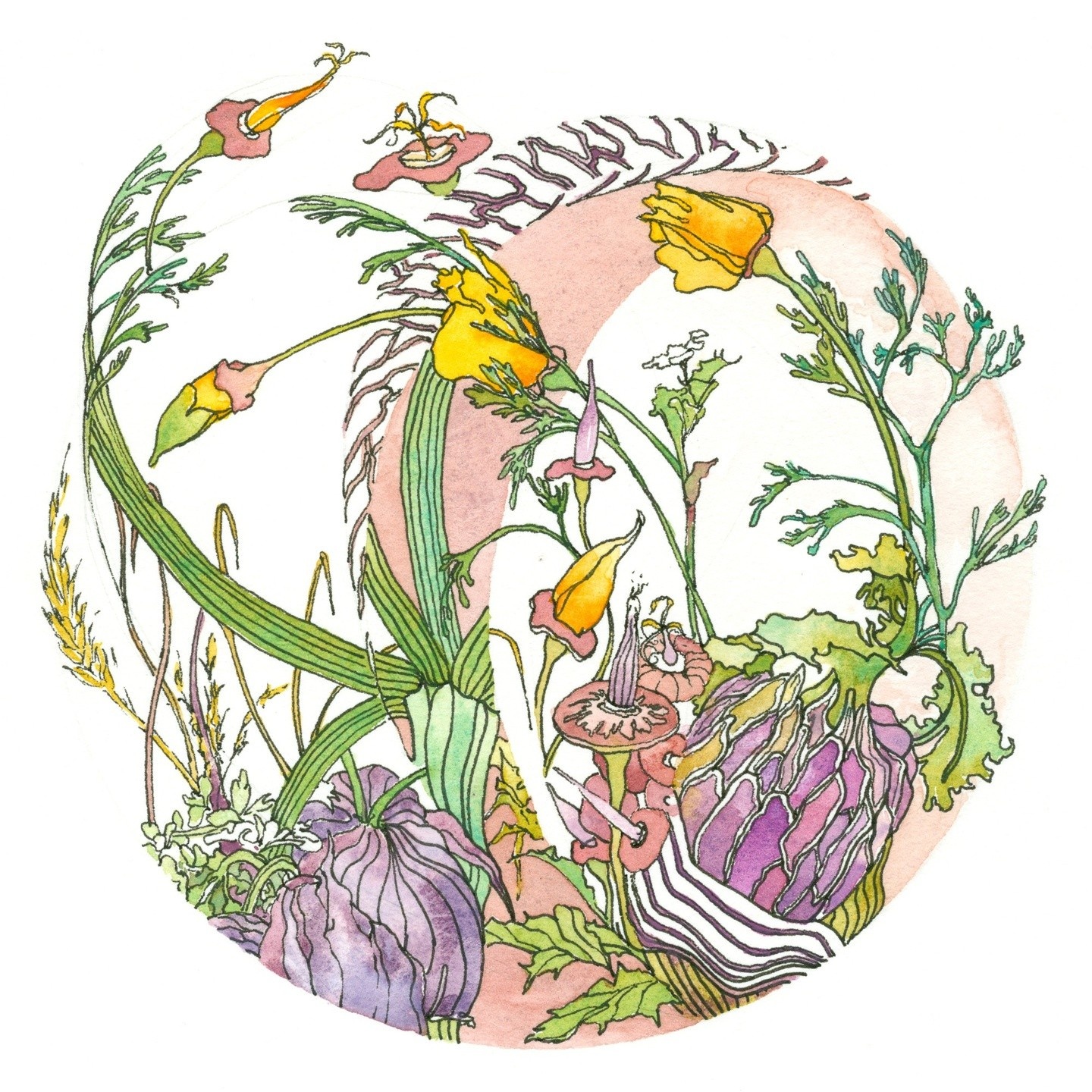
Creating Dala Art
Dala Art is art designed within a circle that has been divided into segments by one continuous line that may or may not cross over itself.
The updated, enhanced version of Creating Dala Art will be offered once a year with limited enrollment for a more comprehensive, interactive learning experience. In addition to recorded videos the 2022 update includes live Zoom demos and live Q & A sessions.
Learn MoreTo view all the available courses click the link below or the tab at the top of the page. In most classes the lessons are presented at three levels: Basic, Intermediate and Advanced. I suggest you try the projects at all three levels regardless of where you feel you are as an artist. Reviewing skills and challenging yourself to learn new skills a bit beyond your current ability is how you grow stronger as an artist and master the skills that are important for you to be able to express your own experiences in the style you desire.
View All Available Online Courses